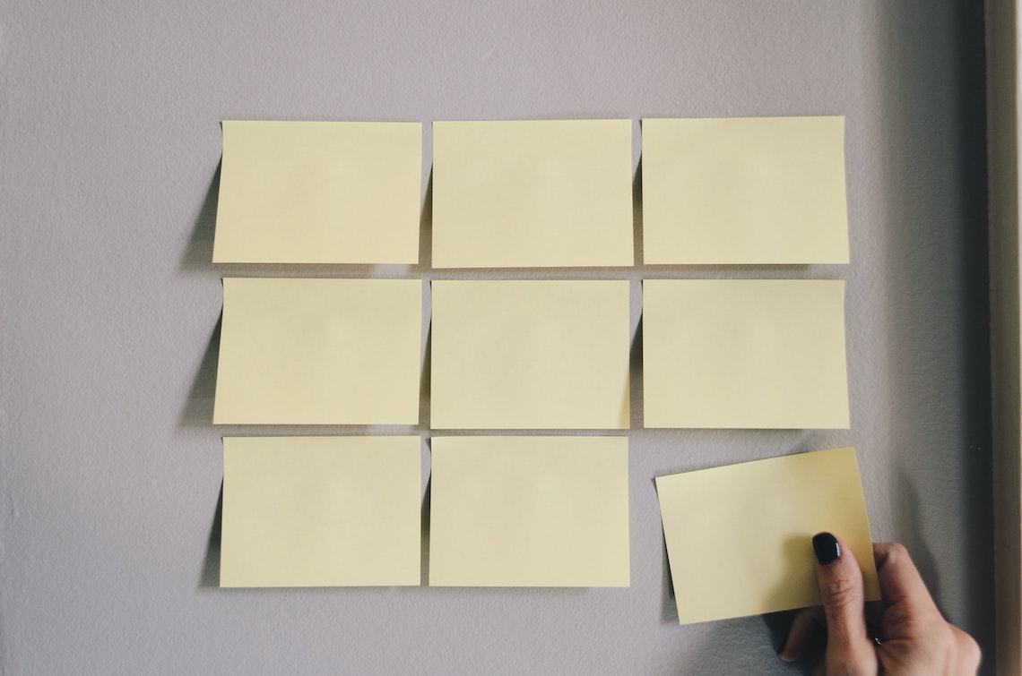
Today, we're going to learn the basics of CSS Grid. Let's dig in!
What is CSS Grid?
As the name implies, CSS Grid is a way to define a grid-based layout: a set of rows and columns (not unlike a table).
To create a grid with CSS Grid, you specify the number of rows and columns, and wide and tall each one should be.
If this photo of sticky notes below were a CSS Grid, it would be three columns wide, and three rows high.

Fractional units (fr)
You can use all sorts of different units of measure to define the size of your rows and columns, but the most versatile and useful is the fractional unit, fr.
A fractional unit is equal to one column or row out of the total number of columns or rows. In the 3x3 sticky note grid above, 1fr is equal to one-third or 33.3%. In a four-column grid, it would be equal to one-fourth, or 25%. And so on.
Creating a CSS Grid
Let's imagine we have a .grid-3x3 element, with nine elements nested inside it.
<div class="grid-3x3"> <div>1</div> <div>2</div> <div>3</div> <div>4</div> <div>5</div> <div>6</div> <div>7</div> <div>8</div> <div>9</div> </div>
We want this HTML to look like the 3x3 arrangement of sticky notes in the image at the top of this article.
To start, we'd define the display property for our .grid-3x3 class with a value of grid.
.grid-3x3 { display: grid; }
Then, we can define the number of grid-template-columns and grid-template-rows in our layout.
For each column and row, we need to specify the width or height. Since we want them to all be the same size, we'll use one fractional unit, 1fr, for the value.
.grid-3x3 { display: grid; grid-template-columns: 1fr 1fr 1fr; grid-template-rows: 1fr 1fr 1fr; }
Now, we have a 3x3 grid of equally sized elements. Here's a demo.
The repeat() function
Defining each column and row manually is tedious, especially for larger layouts.
The CSS repeat() function (yes, CSS has functions, it's a real programming language) can be used to define a repeating number of rows or columns and specify the same width or height for each one.
Pass in the number of times to repeat the value and the value to repeat as arguments.
.grid-3x3 { display: grid; grid-template-columns: repeat(3, 1fr); grid-template-rows: repeat(3, 1fr); }
Here's an updated demo.
Adding a gap
You probably don't always want your grid items nestled directly up against one another.
You can define the amount of space between each grid item using the gap property.
.grid-3x3 { display: grid; grid-template-columns: repeat(3, 1fr); grid-template-rows: repeat(3, 1fr); gap: 1rem; }
If you want to define the space between columns and rows separately (or only define one or the other), you can use the more specific column-gap and row-gap properties instead.
.grid-3x3 { display: grid; grid-template-columns: repeat(3, 1fr); grid-template-rows: repeat(3, 1fr); column-gap: 1rem; row-gap: 2rem; }
Here's a demo of a Grid layout with a gap.
Varying sizes
In our Grid layout, all of the elements are currently the same exact size.
But what if you wanted the middle column to be twice as big as the left and right?
To do that, we can go back to manually defining each column size, and set the middle column to be 2fr, two fractional units, instead of one.
.grid-3x3 { display: grid; grid-template-columns: 1fr 2fr 1fr; grid-template-rows: repeat(3, 1fr); gap: 1rem; }
Here's a demo of irregularly sized columns.
Creating a reusable system
Tomorrow, we're going to look at how use CSS Grid to create a reusable grid system for your projects.
Cheers,
Chris
Want to share this with others or read it later? View it in a browser.


0 Komentar untuk "[Go Make Things] An intro to CSS Grid"